AB Testing: 3 Call-to-Action Button Tests to Optimize Conversion
If you’re promoting your game or app via a landing page, AB testing your call-to-action (CTA) button is a must. Why? Your CTA button is arguably the most important element on your lander. It’s what converts visitors to customers and because of it, determines your page’s effectiveness. The only way to ensure your CTA button is performing at its very best is with AB testing.
What is AB Testing?
Before we dive into how to perform AB testing, let’s define what it is. AB testing, or AB split testing, compares the effectiveness of two versions of a web page, marketing email or the like, to discover which has a better conversion rate. CTA button tests are a type of AB testing.
How to Perform AB Testing?
For accurate results, it’s important to control as many variables as possible when performing AB split testing. For CTA button tests, you’ll need to control the landing page design and traffic. Start by building two identical landing pages with different CTA buttons. Once these pages are live and ready, drive equal amounts of traffic to each. The page with the highest conversion rate at the end of the test is the winner.
3 CTA Button Tests to Optimize Conversion via AB Testing
Using the method described above, here are three CTA button tests every indie game dev should perform to optimize his or her landing page.
- Design Test
There are three parts to CTA button design, which I like to call the Three Bs. Good CTA buttons are big, bold and beautiful. Big describes the physical size of the button: good CTA buttons are larger than other buttons or links on the page. Bold describes the contrast between the button and the background of the page: CTA buttons must stand out. FInally, beautiful describes the user friendliness of the button: is the button inviting and encourage clicking? As you conduct design AB split testing, consider each design factor.

An excellent example of a big, bold and beautiful CTA button from Status Board.
-
Placement Test
While it may seem inconsequential, the placement of CTA buttons can have dramatic effects on conversion. Other than adhering to the standing rule of above the fold, AB split testing of left vs. right and top vs. bottom are good placement tests to run.

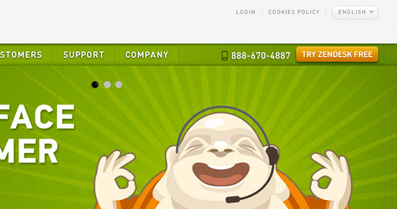
Zendesk places its CTA button in the top, right of the screen.

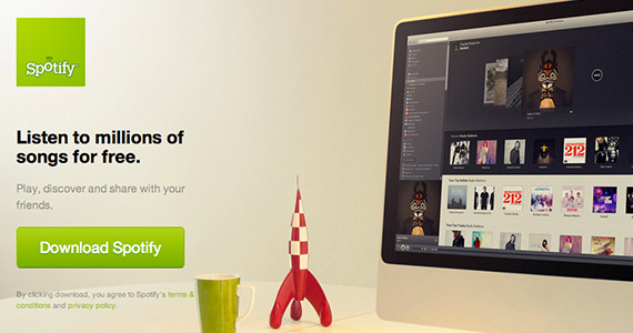
Spotify uses the bottom, left of the screen.
-
Verbiage Test
To Download Demo or to Try Game for Free, that is the question. Simple nuances in language like these make all the difference. When thinking about what verbiage to use on your CTA buttons, try to imagine yourself as a user. What words make you click buttons or turn you away? As a general rule, stick to action verbs, i.e., download, get, try, etc. Also, try to stay away from scary words like install and submit when performing your verbiage AB split testing.

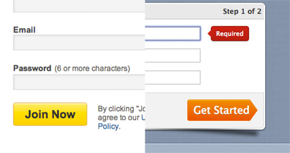
Both sites are encouraging the visitor to sign up. LinkedIn (left) is using the verbiage “Join Now,” whereas Swagbucks (right) is using “Get Started.”
Above feature image was taken by bodysoulsp.
Leave a Comment
Only registerd members can post a comment , Login / Register


2 Comments
Hao
about 13 years agoGreat insight on what to test to optimize conversion! Emmy, do you have any experience using optimizely.com to do any of this AB testing?
Emmy
about 13 years agoThanks Hao! Glad you liked the post. I have never used Optimizely before, but I just checked it out and it seems incredible. I wish they had a free trial, but I may have to splurge for the Bronze plan just to test it out. Thanks for the tip, this looks pretty darn cool!